Remarkably enough, this is my first ever blog entry. Most of my friends and colleagues have their own blogs but I've resisted the pressure to start my own. When Brian Ulrich asked me to participate in this blog for Daylight, I felt that the timing was perfect. For one, I really like the idea of a specific time frame to work in. There is a clear beginning and end to the process which should end up encapsulating this short time period in a definable work. It also happens to coincide with one of the most interesting, worrisome, frightening and hopeful times in world history. I have a BA in history from The University of Vermont so history has long been an integral part of my consciousness and has helped immensely in shaping my world and artistic view.
There are several issues I would like to write about in the next fours weeks. Much of it will deal with the many thoughts I've had recently regarding art, economics and politics. I am particularly interested/concerned about how the current major changes in the world order will affect art, both on the macro scale (galleries, museums, auctions) and on the micro scale (the individual artists). As blogs are intended to be a forum, I would also like to address issues or questions that readers are thinking about.
For this first post, I thought I would begin with an introduction in order to give some context. I was born in 1972 in Chicago but I was brought up in the Boston area. I spent seven years in Burlington, VT, four of which were spent getting my BA from The University of Vermont in history and geography. The next three years were spent in Canton, NY where I worked full-time as the University Photographer at St. Lawrence University. It was these three years in a remote area of New York State that gave me the impetus to apply to MFA programs ultimately bringing me to Chicago and Columbia College in 2000. I finished my MFA in photography in 2003 and I've been working as a professional artist and educator ever since.
My work as a commercial photographer in my early career has greatly influenced my personal artwork. I fumbled about in graduate school for a couple of years before finally finding my voice through The Untitled Project. The project is a deconstruction of systems of communication in the public space through the use of photography and digital imaging. Each piece is comprised of two elements: one photograph with the text digitally removed from the image, and one graphical text piece that maps out the removed text on a white field. The project has helped me to explore and understand the complexity of the myriad forms of communication used to inform, influence and control large groups of people.
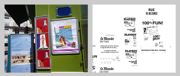
Untitled #35, 2006 from The Untitled Project.
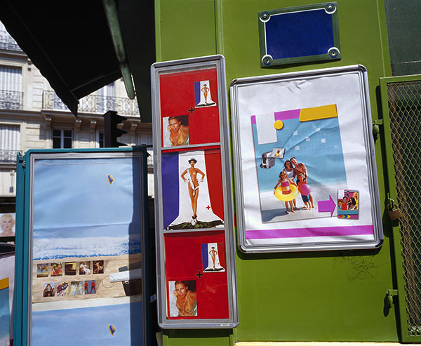
Untitled #35 (image)

Untitled #35 (text)
The following project grew out of The Untitled Project as I directed my artistic attention toward text and signage. Floating Logos may not have come about if I wasn't living in the midwestern United States where the land is flat and the signs are extremely high up. The mountainous and forested landscapes of New England do not lend themselves to tall signs like these. The signs are photographed where they are (they are not super-imposed) and I have digitally removed the support structure. Series I is comprised largely of verticals with the ground left out of the image in order to emphasize the disconnect. Series II is taken in a traditional landscape format where the signs are allowed to float in context with their surroundings.
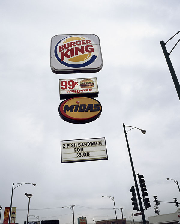
Burger King, 2004 from Floating Logos Series I
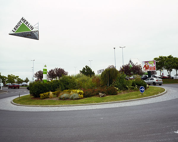
Leroy Merlin, 2006 from Floating Logos Series II
As I continued to think about visual and literary communication as well as marketing and branding, my appreciation for the power of commercial art and design grew. The Compare to… project seeks to deal directly with these issues by using generic or off-brand products found in grocery and dollar stores. By mimicking the visual elements of the major brands, these companies reinforce a set of visual signifiers that have become culturally ubiquitous. Certain colors, shapes and designs have come to signify, not only a brand, but now the product itself. The products are presented on a graphical backdrop created in Photoshop to give the aesthetic of an advertisement. Many of the products do not have brands attached to them at all giving way to the idea of the product itself being advertised rather than the abstract notion of the brand.

Mouthwash, 2006-7 from the Compare to… project.
As Compare to… began to move away from photography by creating a graphical space rather than a window into 3D space, I moved a step further away from photography by working with words alone. The Lists series (working title) does something similar to Compare to… but uses the names of products rather than their packaging to help us think about the ways in which they are marketed to the public. It also becomes a somewhat nerdy study of language and semantics.
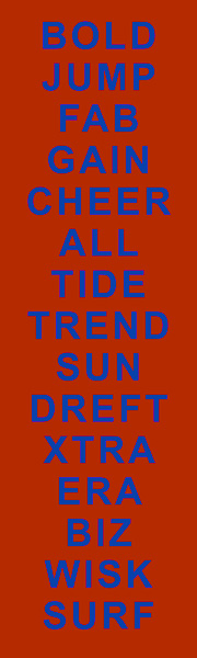
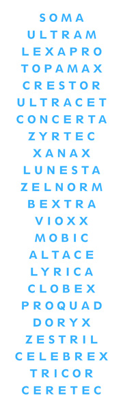
Detergent (left) and Drugs (right) from the Lists series.
This should give a good sense of where I am coming from and how I got to where I am now. My work tends to feed on itself with one project leading directly into the next. The threads are usually very clear when the work is placed in chronological context. In the coming weeks, I will make postings about some of my work in progress that should make more sense in context with the earlier projects.
I will be away for a few days this week for Thanksgiving but I will post again when I get back on Sunday or Monday.
- MS